|
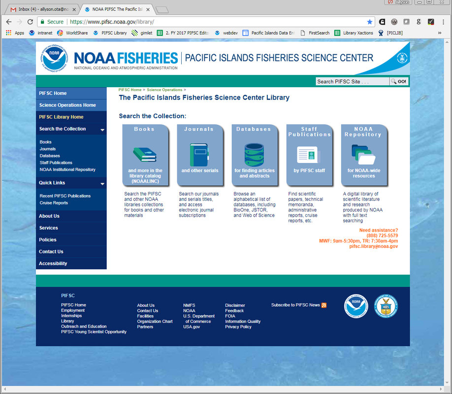
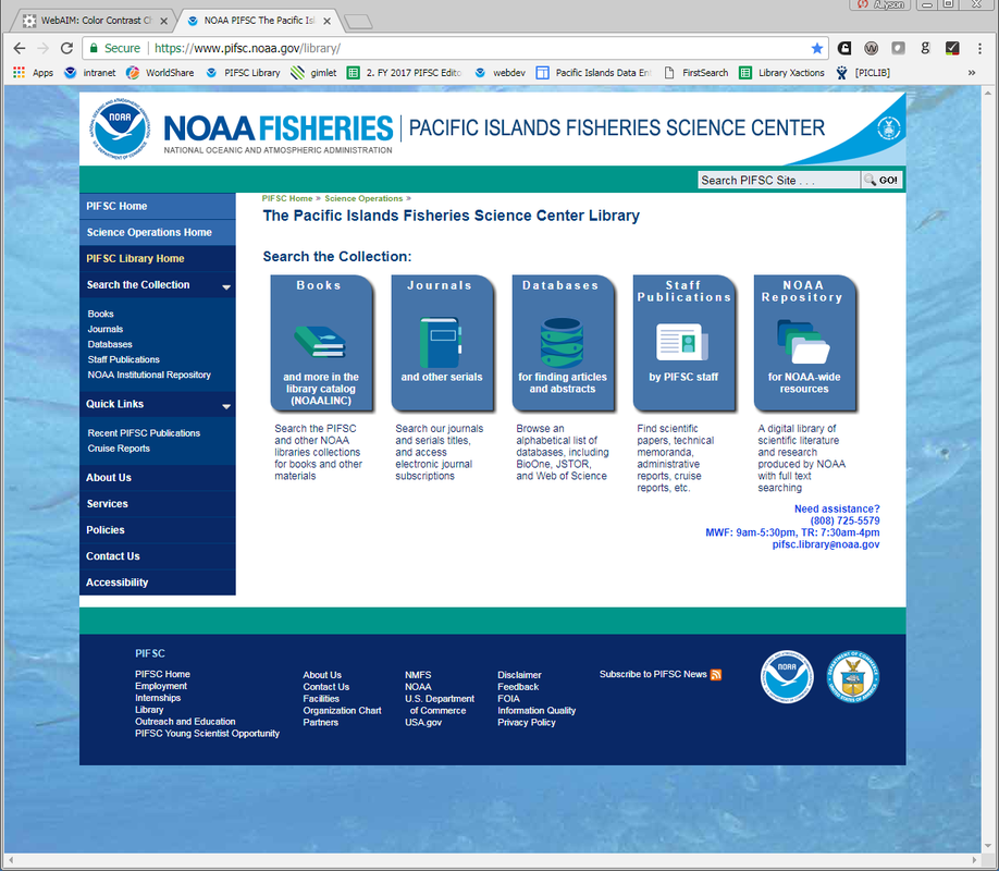
I've been working towards making the library's online presence accessible to all audiences in accordance with Section 508 of the Rehabilitation Act (29 U.S.C. 794d). Section 508 is a federal law that requires agencies to provide individuals with disabilities equal access to electronic information and data. More information on Section 508 and its technical standards can be found at Section508.gov. Today, I paid particular attention to contrast. Colors add design elements to your site but make sure it's compliant to accommodate those with difficulty seeing contrast between colors. The excellent video below came recommended by my coworker who recently ran a workshop for NOAA authors to help them understand the importance of contrast in their publications. Our web pages were fabulously redesigned last year by my predecessor, and she did a fantastic job! Today I just had to tweak some of the colors to be compliant. I used the WAVE web accessibility evaluation tool plug-in for Chrome which I got from WebAim. It was recommended by our web master and is an easy add-on to use. Simply go to the page you want to evaluate, and then click the "W" button in your toolbar and select "Contrast" from the panel to see any discrepancies. 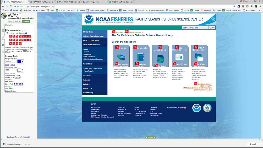 The red shows discrepancies between foreground text and background color. Clicking any flagged element will bring up the two colors being compared and will show their rating. The red shows discrepancies between foreground text and background color. Clicking any flagged element will bring up the two colors being compared and will show their rating. In order to calculate some good replacement colors between backgrounds and text, I utilized the Color Contrast Checker at WebAim.org. I had to ensure the new colors would be compliant with WCAG 2.0 required contrast ratios and I also wanted to stay loyal to the design. See the before and after results below. You can click each image to see it larger. I've made some other updates, but today's update was fun and allowed me to use some handy tools so I wanted to post about it in case it helps anyone out there.
0 Comments
|
Dropping Mad Library Science!Here is where I write about everything library and archives related going on. Categories
All
Archives
September 2020
|
 RSS Feed
